Jan 11, 2025
Swing, and a miss!
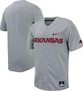
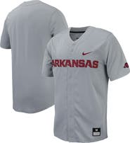
It's thin and very easy to rip. But my biggest gripe is the baseball logo. all the other jerseys have the team name script, and USC has the SC! It is poorly executed, with a big gap across the chest. The Baseball "SC" is on their hats, so there's no need for it on the jersey. It's just another example of why we don't like the sports products Nike is putting out. Stuff is too narrow and too long, very assembly line made with the least costing materials, are these meant for the blue aliens from Avatar?
Reposted from Nike
ijaurigu